Graphs
Graphs are used to visually analyze search results. Here is a sample graph:

Example Graph
This image shows one of the predefined charts, Well Drop. The Barcode is shown on the x-Axis and the No. of Results are shown on the y-Axis. In the legend, there are score colors, and each of the horizontal layers on the bars represent one of the scores. The height of each bar shows the No. of Results of that score against that Experiment Plate Barcode.
Predefined Charts
The Predefined Charts list provides several chart types for your use. You can select any of the predefined charts to see the desired data. The predefined charts combo box populates based on the display fields you select.
Predefined Charts List:

Predefined Charts
Drops vs. pH
Drops vs. Concentration
Drops vs. Ingredient
Plate vs No. of Drops
Project vs No. of Drops
Protein Conc. vs No. of Drops
Screen vs. Hits
Screen vs. Hit Rate
Well Number vs. Hit Rate with Screen as Series
Screen vs. Hits

Screen vs. Hits
The default chart is called Screen vs Hits. It shows the various screens used in your experiments along the X-axis, and the number of times a well within that experiment was scored according to the Score Constraint you set earlier along the Y-axis. This shows you which of your screens has produced crystals with the most (or the least) success.
In the above example, the bar representing the Crystal Screen HT indicates that there were a total of 8 instances of the score(s) being searched for in all uses of that screen in the experiments being searched.
Screens vs. Hit Rate

Screens vs. Hit Rate
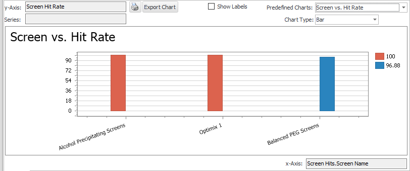
A second chart available from the Predefined Charts list is called Screen vs Hit Rate. This presents the same information, but with the Y-axis shown in terms of percentages, rather than raw data about the number of scores per screen.
In the above example, the bar representing the Crystal Screen HT indicates that 8.33% of the wells from all uses of that screen in the experiments being searched had a score value equal to the score(s) selected. Correlating this to the previous example, we can conclude that there were 96 total wells (8 out of 96 equals 8.33%), which is one use of the screen in the experiments being searched.
Well Number vs. Hit Rate (with Screen as Series)

Well Number vs. Hit Rate with Screen as Series
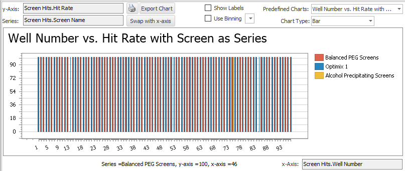
The third chart is Well Number vs Hit Rate. This shows the Well Number along the X-axis and the percentage of matching scores along the Y-axis. In order to get the clearest visual analysis from this chart, you will want to limit the number of screens being shown in the chart.
To apply this filter, use the checkboxes in the Screen Name drop-down menu available at the top of the Filters Dock Panel. In the example chart shown above, the data is filtered to show data from only one screen, the Classic 03.
In the above example, Well No. 10 produced a score matching the one being searched 40% of the time, while all others on the chart only did so 20% of the time.
Chart Type
You can view a chart in different types by choosing a chart type from Chart Type combo box.

Chart Type
Related Topics